Screenshot of the usability test with the participant tapping a mobile app prototype. There is a thumbnail of the participant's face blurred out in the bottom left

Discovering MS Patients' Decision Making Processes During MS Relapses


Our client's strategy was to mobilize Multiple Sclerosis patients at the onset of an MS relapse to seek treatment from their doctor.

Inspired by the Amazon "Dash" button where customers order household products with the push of a button, the client envisioned patients using an app to make contact with their doctor and initiate the approval process.

I persuaded the team to look more closely at the assumptions we had about patients, and the patient problem this concept proposed to solve. I lifted the veil on user research as a way to clarify how this product could have a meaningful impact on MS patients.

I proposed the research methodology, lead the development of the interview discussion guide, initiated and organized all tasks for usability testing, executed all analysis and synthesis, and produced the topline report and presentation of findings.


Project Background

During an MS relapse (an unpredictable episode where MS symptoms either worsen dramatically or occur for the first time) severe impairments in mobility and cognitive function present barriers to many daily life activities.

It was believed that the debilitating nature of relapses and tortuous prescription approval process was causing patients to wait out MS relapses rather than seek treatment. The team felt that eliminating friction towards getting a prescription at the moment of relapse was the way to get patients to take action.

With the "Dash" concept, patients would sign up for support on the brand website before a relapse, downloading the "Dash App" and providing information that would be used towards the approval process when they report a relapse with the app. The app would include the Assessing Relapse in MS Survey (ARMS) which patients complete to help doctors evaluate symptoms.


Research Statement, Goals, and Methodology

Embedded in the Dash concept were a couple of assumptions that I thought needed exploration:

  • Patients don't report relapses because of the burdens of doctor visits and the ensuing approval process for treatment
  • Patients don't report relapses because they are too physically and cognitively incapacitated to do so

We needed to look more closely at the point of relapse and what was happening at this moment.

Research subject:

MS patients' decision making processes at point of relapse

Research statement:

We want to discover how MS patients make decisions about their condition during a relapse so our brand can appropriately support patients in getting treatment.

Learning goals:

  • Discover what a relapse means to MS patients physically and emotionally

  • Discover patient needs and desired outcomes when experiencing a relapse

  • Learn about barriers to those desired outcomes, and barriers to taking action on their condition during a relapse

  • Understand how they view MS treatment, and why they view it that way


I proposed doing one on one interviews with MS patients. We would run interactive mapping and collaging where patients could take us through a relapse, mapping out their actions and emotions with drawing materials and object prompts. This could open up recollections of a past relapses where trauma may have clouded memory, and facilitate descriptions of complex emotions.

I looked forward to the rich descriptions and how that would build empathy among our all our internal specializations and the client, and then how the artifacts would lead to rich discussions after the interviews were done.

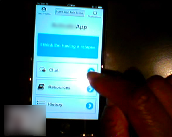
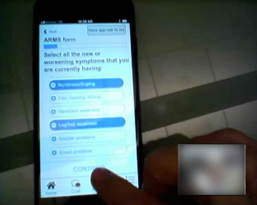
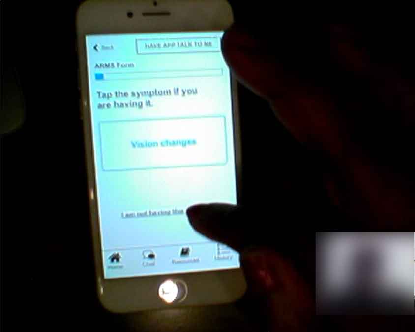
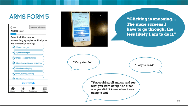
However, the client had lots of heart for the Dash concept. With the team sold on this idea, I had to pivot the research so that a concept prototype would be tested. My goal was to execute a usability test but also use the app as a stimulus for participant descriptions of complex emotions and behaviors.

Revised Research subject:

MS patients' interactions with the Dash app

Revised Research statement:

We want to learn if our concept of the Dash app meets patient needs during a relapse and how they can use it to take action on their condition

Revised Learning goals:

  • Evaluate the design and flow of the app to learn if participants understand how to use it

  • Evaluate the content and features of the app to see if it meets patient needs

  • Uncover pain points during an MS relapse


The team agreed to a hybrid of open ended questioning and usability testing. We tested an Axure prototype, running the in-person interviews with Morae.


Discussion Guide and Interviews

The discussion guide began with open ended questions about patients' day to day experiences with MS, questions about how they communicate with their doctor and descriptions of what happened during their relapses. Then it moved into the app, having users go through the key flow of reporting a relapse:

The discussion guide in an Excel sheet that has the interview prompts on the left and screenshot of the prototype that those prompts apply to on the left

An excerpt from the usability testing section of the discussion guide:

  • Imagine you are having a relapse. You've opened that app and want to report the relapse. Show me how you would do that.
  • Describe what you think is happening.
    • Tell me how you feel about that.
    • Describe what should happen if you tap, "Report Relapse."
    • Please tap "Report Relapse."
  • Take a look at this screen but please do not tap anything at this moment. Let me know when you are done.
    • Tell what you think is happening
    • Without tapping anything, what do you want to do here?
    • Why do you want to do that?
    • Is this right? Explain how you feel about this.

a screenshot of the usability test with the participant tapping a button on the mobile app prototype. There is a thumbnail of the participant's face blurred out in the bottom left

For the ARMS survey (where patients complete a survey for doctors to evaluate symptoms), we tested two different designs to understand which was easier for users:

  1. More survey selections on screen at one time, but less steps to get through to complete the survey. Each screen had a question with a list of selections, and sometimes the list would be scrollable
  2. The "Tinder" option: a series of yes or no questions. Each screen presented a symptom the user either confirmed or denied. More screens, but simpler interfaces with binary choices
 screenshot of the usability test with the participant tapping selections on the list in option 1 of the survey of the mobile app prototype. There is a thumbnail of the participant's face blurred out in the bottom right

Option 1: More survey selections on screen at one time, but less steps to get through to complete the survey.

 screenshot of the usability test with the participant tapping one of the binary selections on option 2 of the survey of the mobile app prototype. There is a thumbnail of the participant's face blurred out in the bottom right

Option 2: Binary selections

We had users go through each survey and observed any usability pain points and confusion. While we did want to compare the two, I think our real goal was to see what users made of option 2. We hypothesized that option 2 would be favored because it was less to read and presented a simple choice.


Findings and Output

Testing was, at times, messy! Participants did not always understand what the app was for and had a lot of difficulty thinking about it in the context of their MS relapses.

But the prototype, and specifically the flow as we had designed it, pulled out some very interesting reactions that lead to important shifts in our thinking:

  1. While unpredictable and potentially a cause for emergency, relapses were not always incapacitating. Participants described muddling through work in a cubicle while battling cognitive lapses, getting up and making breakfast while being extremely fatigued, and monitoring their toddlers with subpar vision. If they needed to do something during a relapse, they did it.
    • We had assumed that a relapse meant being down and out. While this could be the case, and could require dialing 9-1-1, participants had more capacity than we thought. We had concepted around the assumption that patients would be unable to perform basic activities with a digital device.

  2. Determining a relapse was the biggest barrier to taking action. MS symptoms could vary wildly, and symptoms from other conditions complicated this determination. One participant suggested the order of the app flow should be flipped: first take the survey to certify (or not certify) the relapse, and then report it. The survey was the highlight of the app, and participants expected to save the results for reference during future relapses (The survey was really intended for the doctors.)
    • This was a blind sport for us. The support that patients needed wasn't in reaching out to their doctor and facilitating approval paperwork, but in being certain they were experiencing a relapse.

  3. Option 1 of the ARMS survey was the clear winner. Participants understood what was happening in option 2, but less screens was always better for them. They weren't encumbered by the lists of selections in option 1. Option 2 at times seemed never ending, even with a progress bar.
  4. A Powerpoint slide with a screenshot of the usability test, an image of the survey interface and participating quotes supporting option 1

    Option 1 FTW. This is a slide from the presentation of findings.


Impact and Reflections

After discussing the output with the client it was clear that tools for communicating relapses to doctors was not a need for patients. They already used hospital portals, and some patients were close with their doctors and had them on speed dial. The client saved their resources and folded the Dash app concept.

But the patient problem was reframed as a result of our research for future ideation. Rather than trying to make communicating with the doctor easier:

  • How might we relieve patient anxieties while awaiting a response from a doctor that was not readily available so patients can better plan their next steps?
  • How might we give patients certainty about their MS symptoms to reduce apprehension about contacting their doctor?
  • What are the ways we can help patients manage MS symptoms to lessen the extremes of the relapse experience so they can carry on their daily activities with less interruption?

Additionally, hearing from patients in person had a profound impact on the team. We were moved by their perseverance and how they relayed their experiences dealing with the common slogs of daily life. They compartmentalized their condition in a way that minimized its grip on getting through the hour, the day, week, month or year. MS would never prohibit them for reaching their goals no matter how grand or banal they were. We all felt much closer to these patients than we had before.

Back to Top